L.L.Bean
L.L.Bean was on a mission.
To celebrate their 100 year anniversary L.L.Bean asked us to build a web app to inspire customers to share their outdoor stories. L.L.Bean requested three interlocking components: a company history, a gear giveaway, and an Instagram-like tool that would allow users to post an image or video with text describing their outdoor experiences using L.L.Bean products. This project was completed while working with Almighty.
Paper Prototyping
User Testing
User Flows
Wireframes
UI Design
Prototyping
Project Management
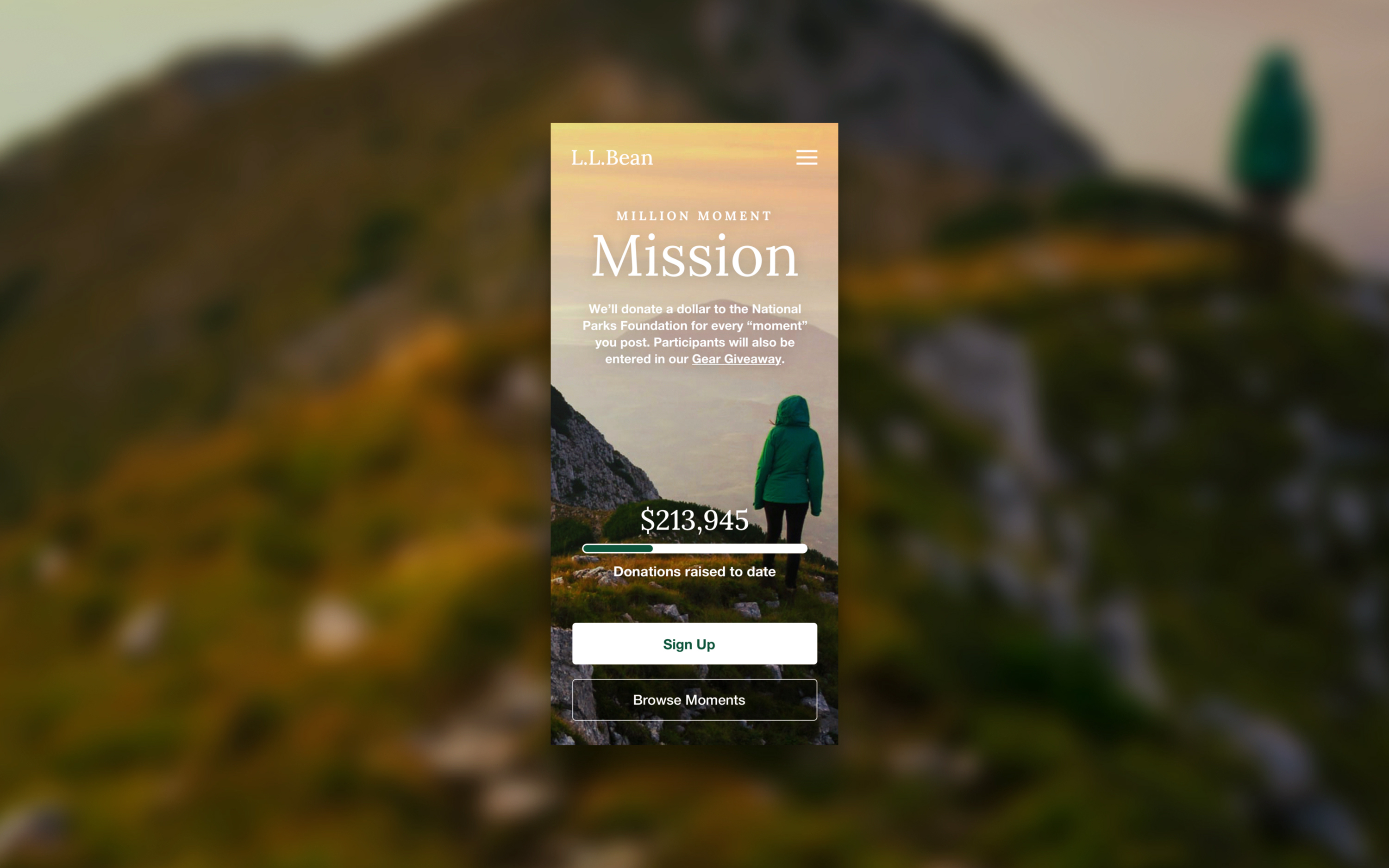
Final Home Page (Mobile)
How it worked
For every posting, which L.L.Bean called “moments", the user would be entered to win outdoor gear and L.L.Bean would donate a dollar to our National Parks Foundation up to $1 million. L.L.Bean dubbed this their “Million Moment Mission.”
L.L.Bean had a clear understanding of their users from ample user research, so we began by sketching out userflows and building low fidelity prototypes to learn which layouts and flows resonated with users during testing.
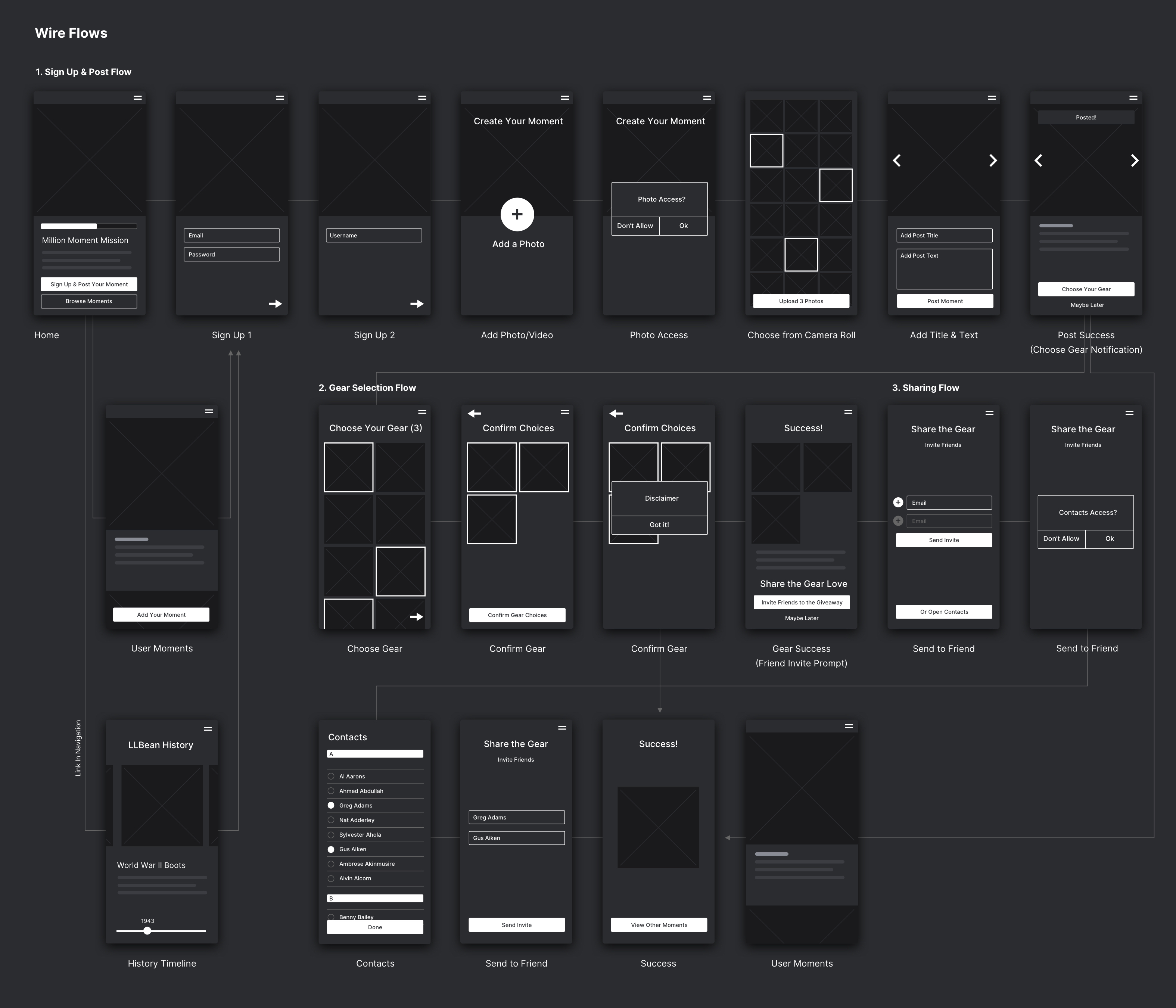
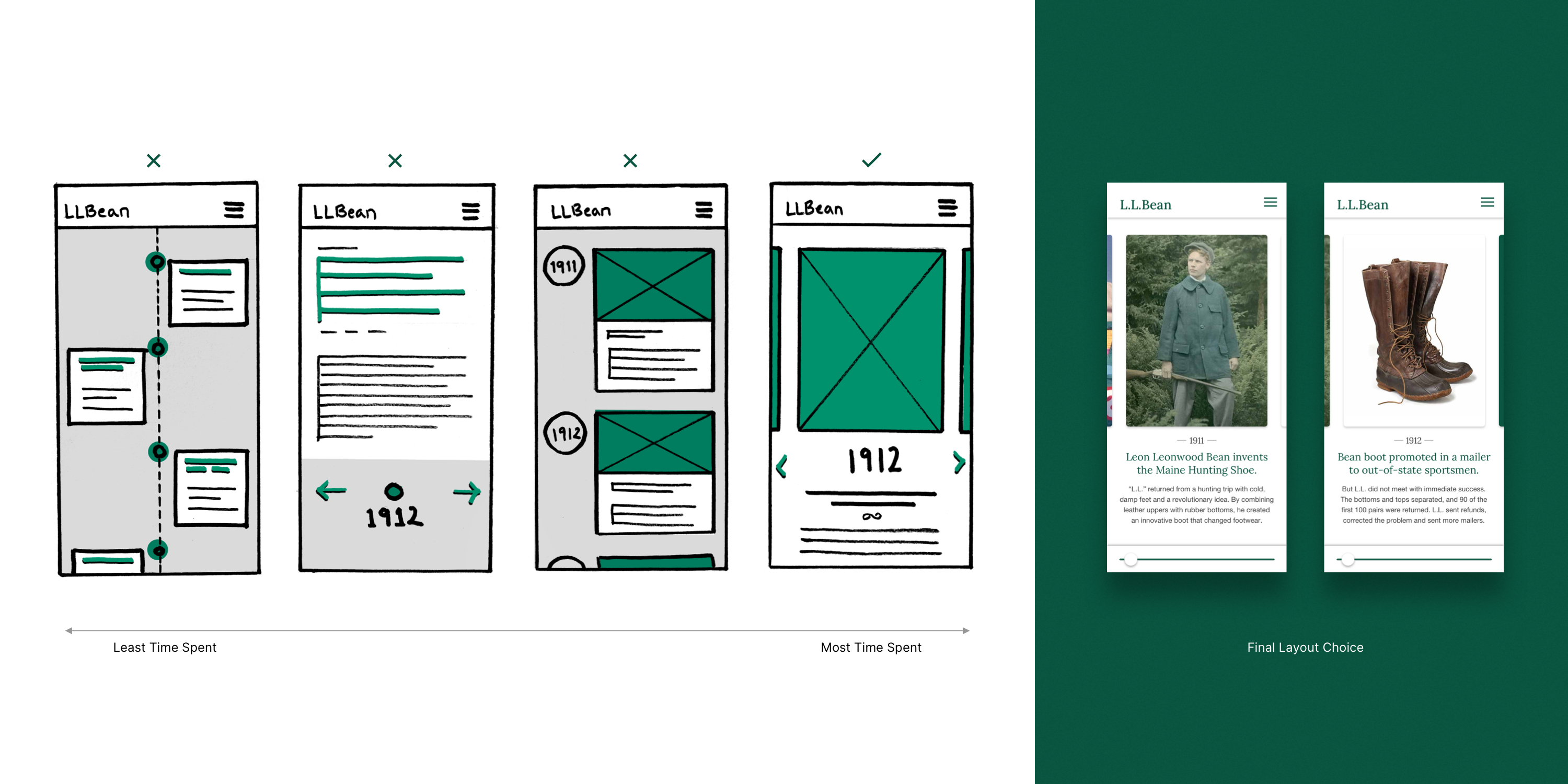
Wireflows (top) & Timeline Sketches with Final (bottom)
We kept post creation simple and form design lightweight
Early testing revealed that users were unlikely to spend more than a minute or two reading about company history. So, our goal for the historical timeline became to provide an entry point to the Gear Giveaway.
Once a user had posted their “moment” they would be prompted to select preferred giveaway items. These gear selections were “preferences” and not “orders”, which needed to be made very clear.
Testing participants said the happy flow was a little long, so we kept simplified our layouts, broke forms up across multple pages and displaced others to separate site sections when possible. This made form completion feel faster and lightweight.
New User Gear Giveaway Flow
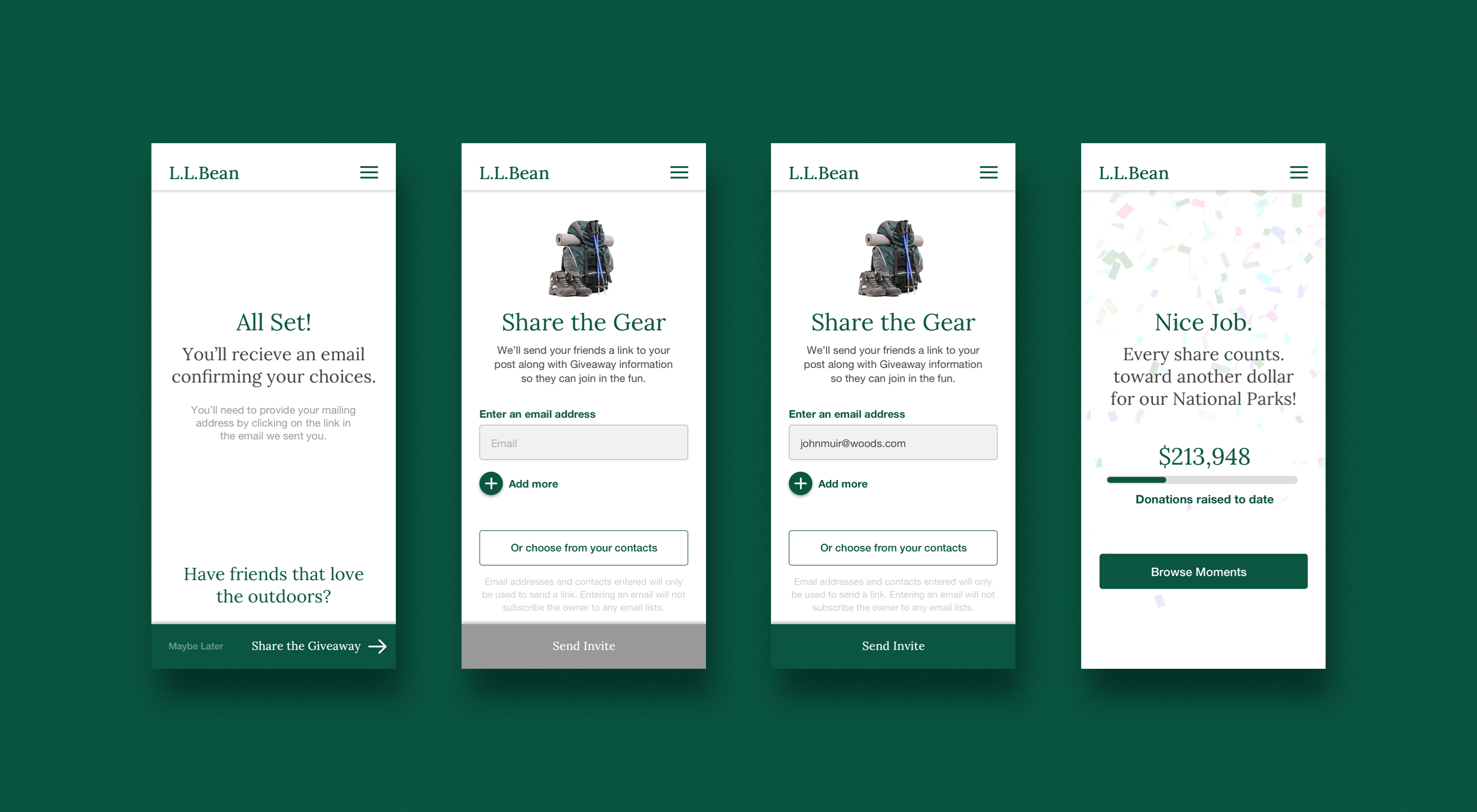
We placed sharing prompts after the user had posted
Having created positive association bias, we placed site-sharing prompts immediately after the user had posted their "moment" and had selected their preferred Gear Giveaway items.
Timeline Feature Sketching & Final
A million posts in two months
The web app performed spectacularly. In just two months L.L.Bean met their goal of one million posted moments. Although they wouldn’t tell us how much value they received out of the effort, they did say they were “very, very happy.”
