Relevant EquityWorks
What do specialist investors need?
Relevant EquityWorks is back-office accounting software for private equity funds. Though known in their industry for robust software, Relevant was facing stiff competition from new comers offering investment portals that catered to retail investors. They asked us to build a portal they could white-label and sell to new and existing fund clients.
User Interviews
User Flows
Wireframes
User Testing
Competitive Reviews
Feature Prioritization
UI Design
Prototyping
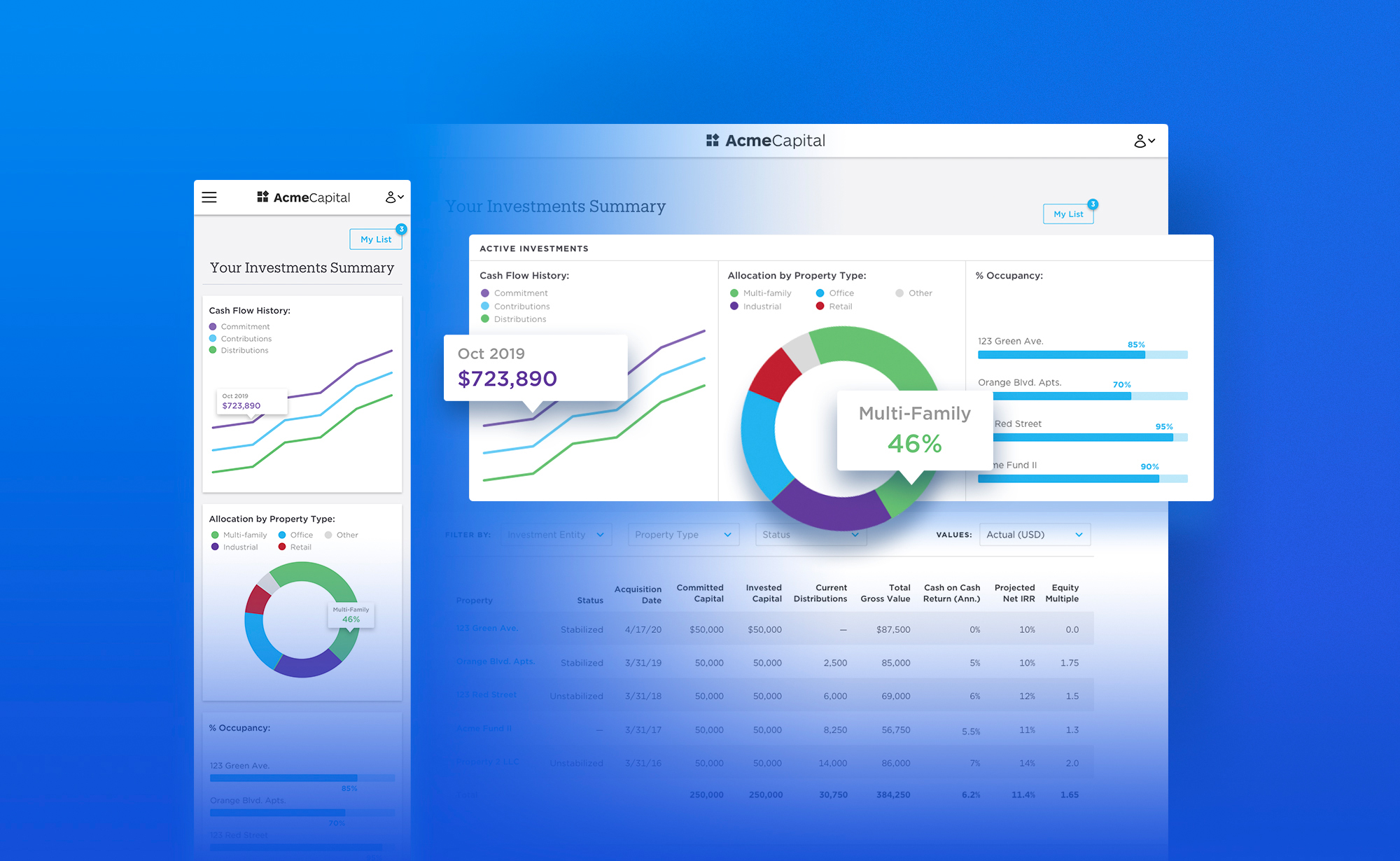
Final Homepage Design
We began interviewing
Participant recruiting was initially slow-going because accredited investors and fund managers are busy people and protective of their time. However, after a couple weeks of searching we collected a dozen well-qualified participants that we could interview multiple times throughout our design process.

Affinity Mapping
Synthesizing research told us that investors are specialists
Our design process was heavily influenced by these aggregated interview insights:
Investors are specialists. Each requires different data to make an investment decision. A real estate investor needs to see Occupancy Rates and Cash on Cash Return, while a venture capitalist prefers Technical Realization Multiples. Since this product will be white-labeled across several investment houses, we will need to provide each type of investor with what they expect to see.
Investors are scrupulous. They want to know everything about an investment before they’ll provide any personal information.
Investors are device agnostic. They switch regularly between laptop, desktop, and phone while managing their investments. Also, most are PC users but have the latest iPhone.
Investors consult others. Advisors and accountants are often involved in investment decisions. Some investors want the ability to delegate the details of execution as well.
They invest through more than one legal entity. It was common to see the same person make investments as themselves, through a business entity, and on behalf of family trusts.
Investment decisions take time. It often took investors to take several weeks to make a single investment decision.
During these interviews we collected competitive product recommendations, which we evaluated next.
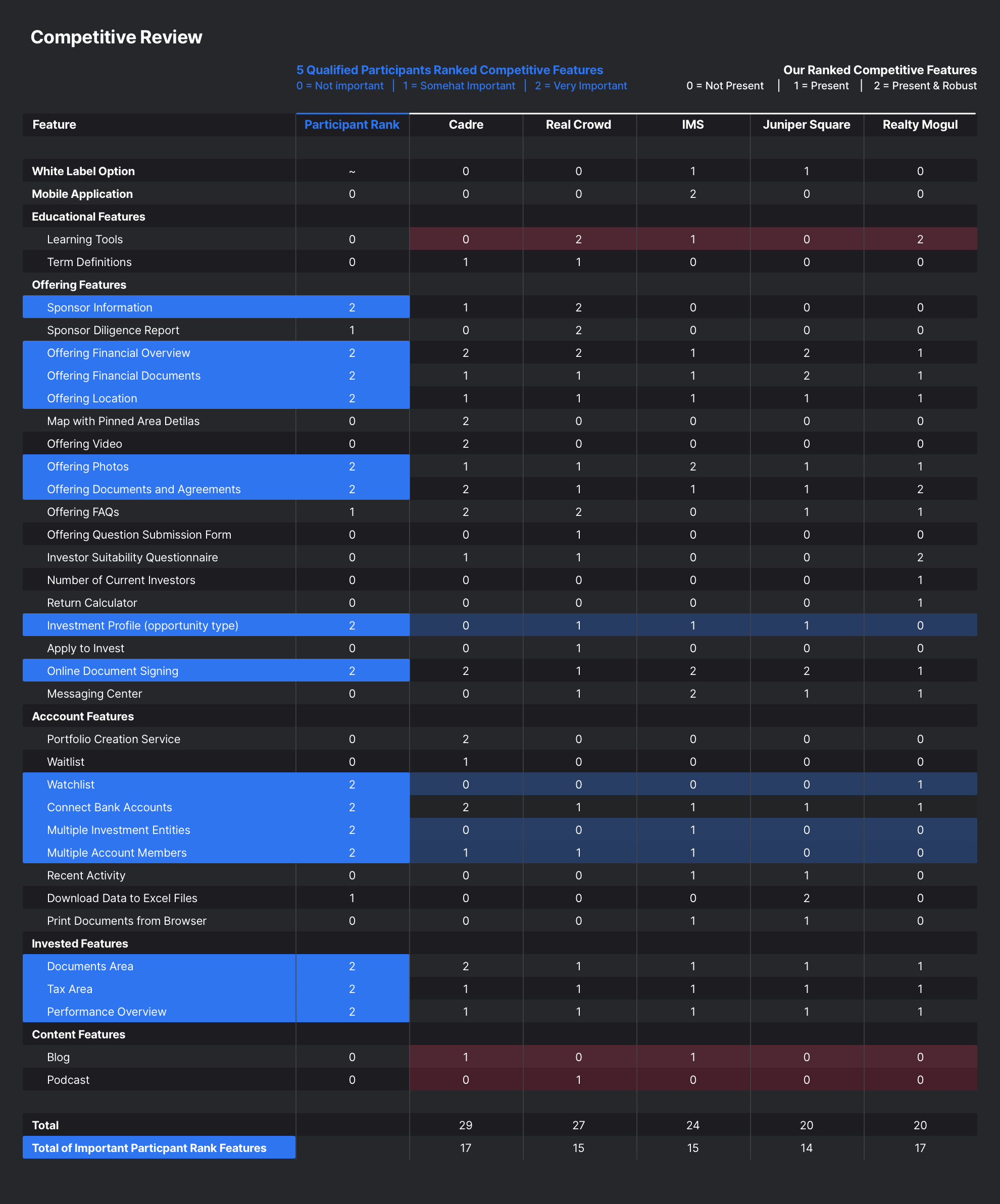
Combined Competitive Feature Review and Participant Feature Ranking
We analyzed competitors and prioritized features with participants
We thoroughly documented recommended competitors and reconvened our participants to determine which competitive features were valuable. We asked participants to rank competitor features by importance and compared those results to our internal ranking of a given feature’s robustness. Clear opportunities surfaced around a watchlist feature and the ability to manage multiple investment entities from a single account. This feature prioritization activity informed our Minimum System Requirements, which would ultimately include versions for each investor persona (Real Estate, Private Equity, Family Offices, Venture Capital, and Private Debt).
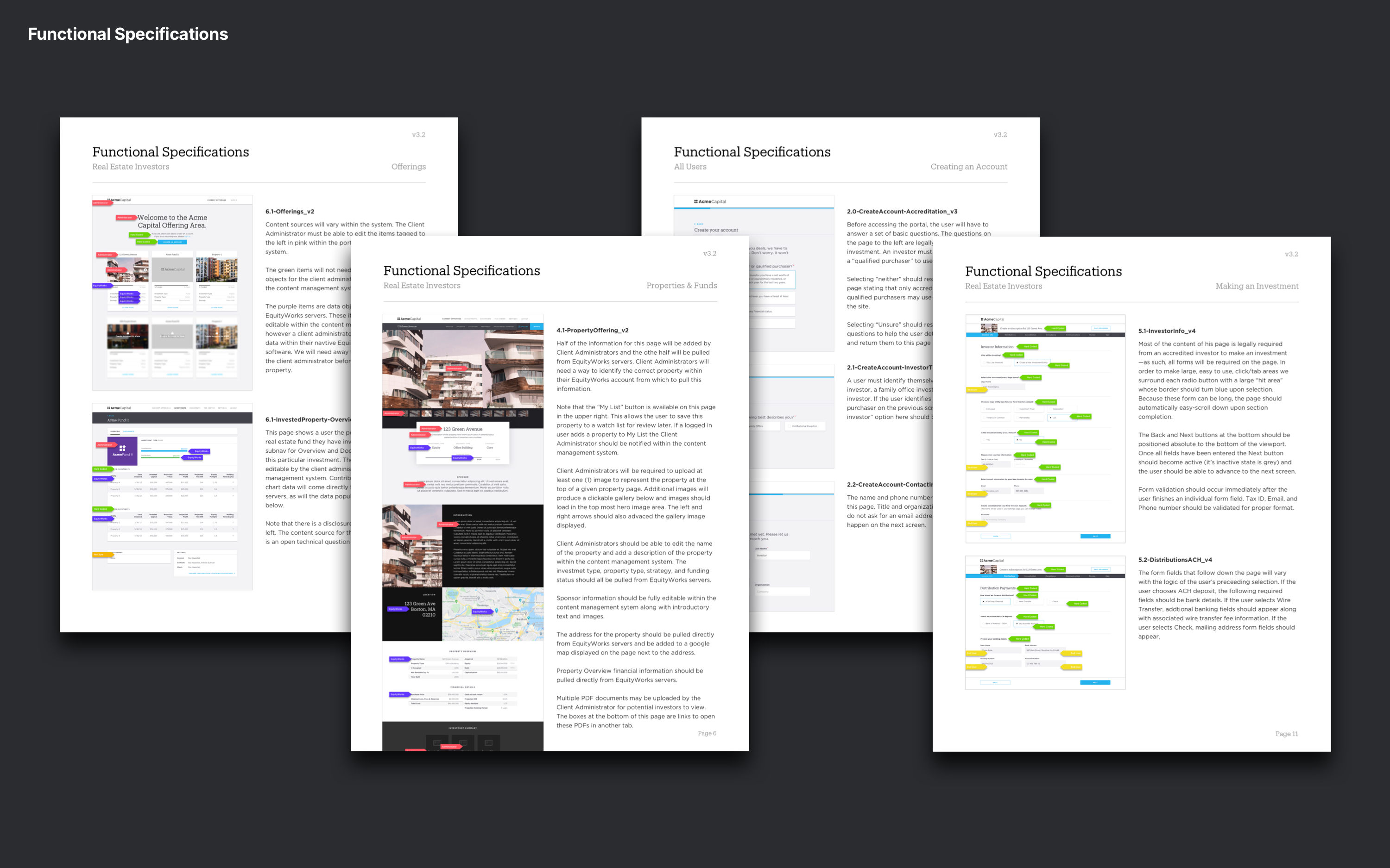
Minimum System Requirements Document with Final Screenshots
Client interest helped us prioritize personas
We consolidated our research into several Investor Personas (one for each type of specialist) and a single Administrator Persona to represent the user responsible for managing and posting investment opportunities. We reached out to Relevant’s client base to understand which persona-based product version would be most valuable. Everything that follows in this case study reflects a client preference for the Real Estate product.
Personas
Real Estate Investor
I don’t provide any information until I’m ready to make an investment.
-IanCommon Scenario
Ian visits multiple investment sites during breakfast, scanning for interesting opportunities. Finding none, he logs into his portal to invest in a property he saved from last week. He is interrupted by his children before finishing his investment, and decides he’ll complete the process on his phone while commuting on the train.
Noteworthy Behaviors
Doesn’t mind using his phone to complete investments. Will frequently turn his phone landscape to read and sign documents.
Wants
Ian wants to see as many photos of investment properties as possible.
Pain Points
Won’t make an investment if he doesn’t have access to all the information. He gets frustrated when the financial labels for documents aren’t what he expects to see.
Fund Administrator
Fund raising requires a lot of leg work and every investment firm I've worked at does it a little differently.
-AbigaleCommon Scenario
Abigale’s fund is 90% filled, but if she doesn’t get to 100% all her fund-raising efforts will be for nothing. She’s already pitched the big players from her contracts, so she decides to post the opportunity to her investment portal. She uploads property photos, introductory financials, and adds detailed agreement docs as PDFs. Through the watchlist feature she’s able to see which investors have saved this opportunity and can reach out to them directly.
Wants
Wants integrated tools that help her manage and automate fund raising and investor relations.
Pain Points
Pulling together lengthy sales presentations and onboarding new investors into the fund is document-heavy and time consuming.
Some features didn’t make the cut
Early usability tests with investors taught us that low-fidelity sketches and wireframes were not be enough to gather actionable feedback—it was too ‘messy’ for them to feel comfortable. So, we designed a handful of 2-3 page high-fidelity wireframes for use in a series of quick feedback sessions. Doing this early made it possible for us to quickly scrap features that our participants didn’t care about.
Here are a few of the features that didn't make the cut.
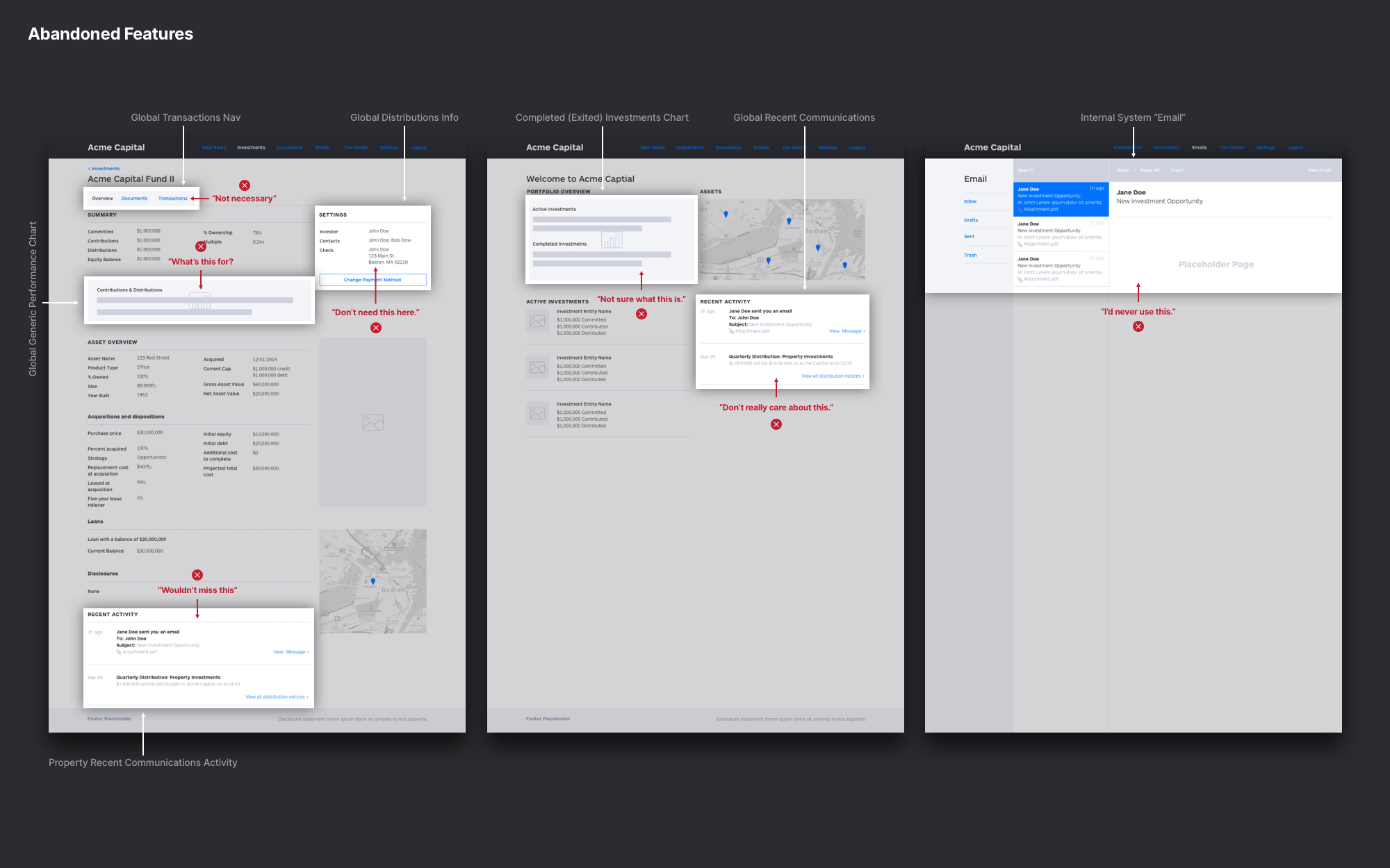
Abandoned features
Task analysis lead to understanding business logic
We documented the tasks each investment firm administrator required for accepting a new investor. This process is lengthy and requires a significant amount of up-front information collection that is dependent upon investor type, status, and location. For instance, onboarding a U.S.-based individual investor will require a very different set of documentation than a Non-U.S.-based legal entity. We mapped the form logic on a series of shared Miro boards.
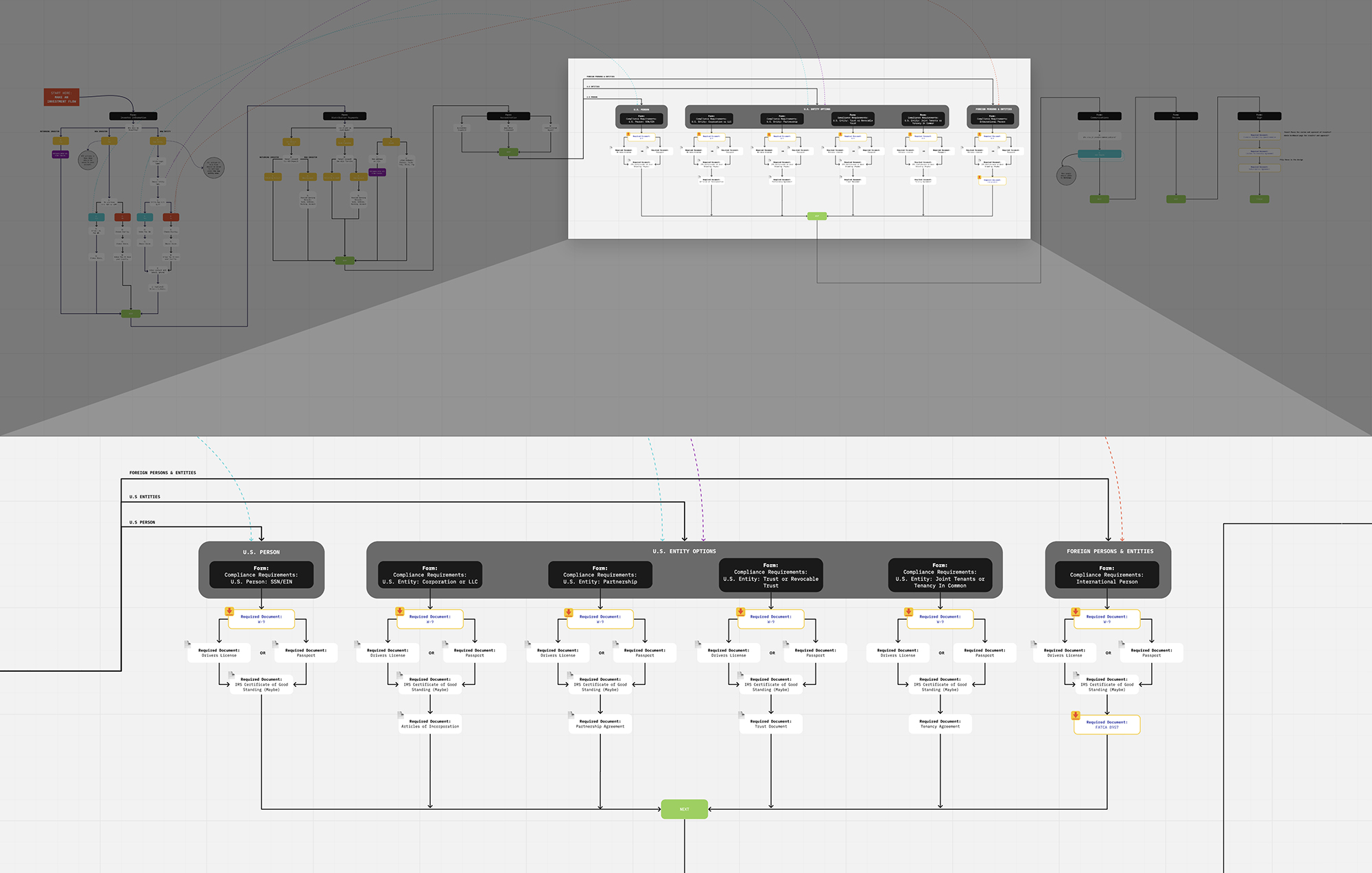
Business logic and requirements board
Breaking down critical flows
We simplified our prototyping and user testing into manageable flows that streamlined the feedback we received. Once we had tested the individual flows multiple times we consolidated them into a single comprehensive prototype that totaled 230+ pages.
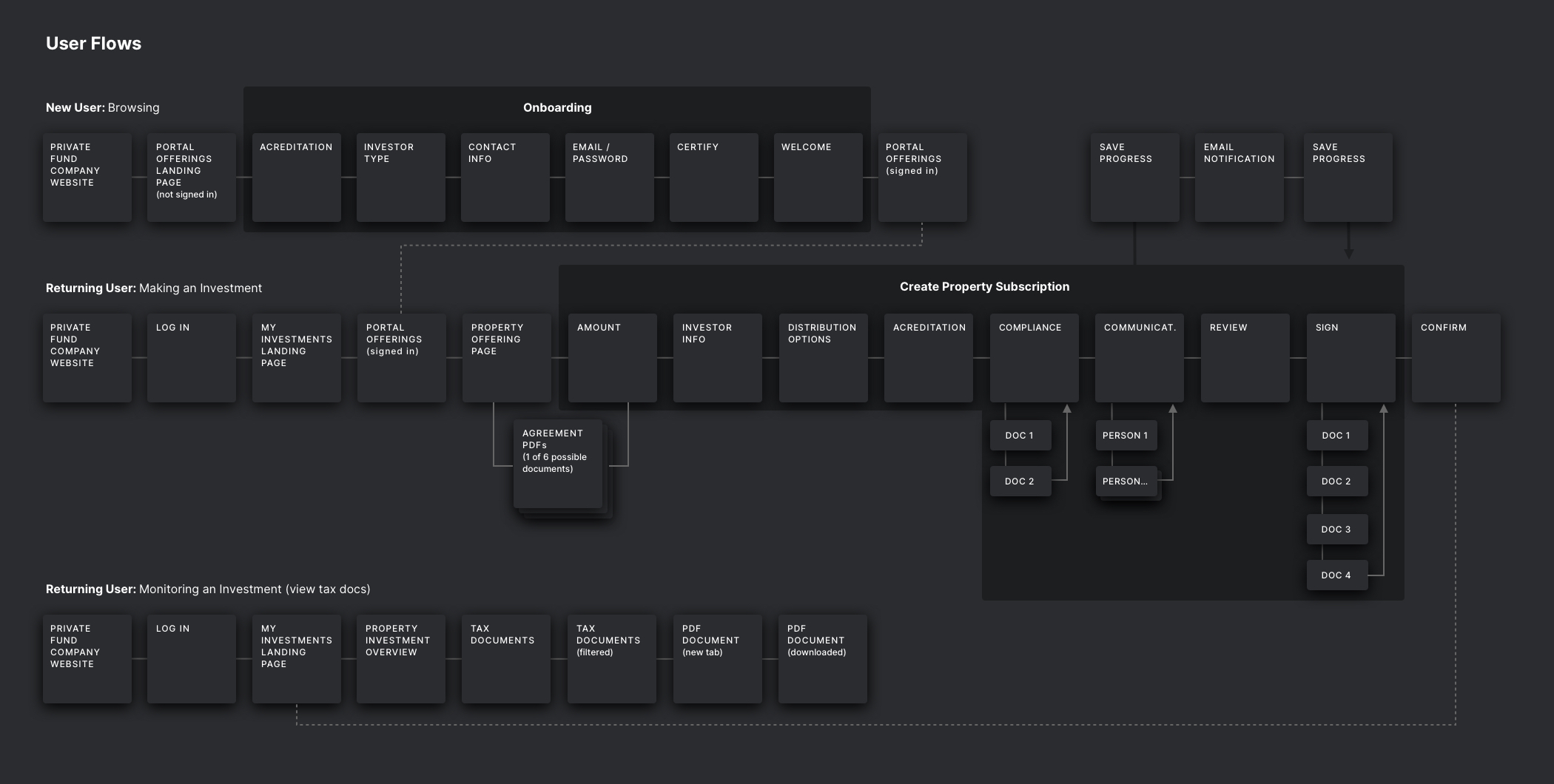
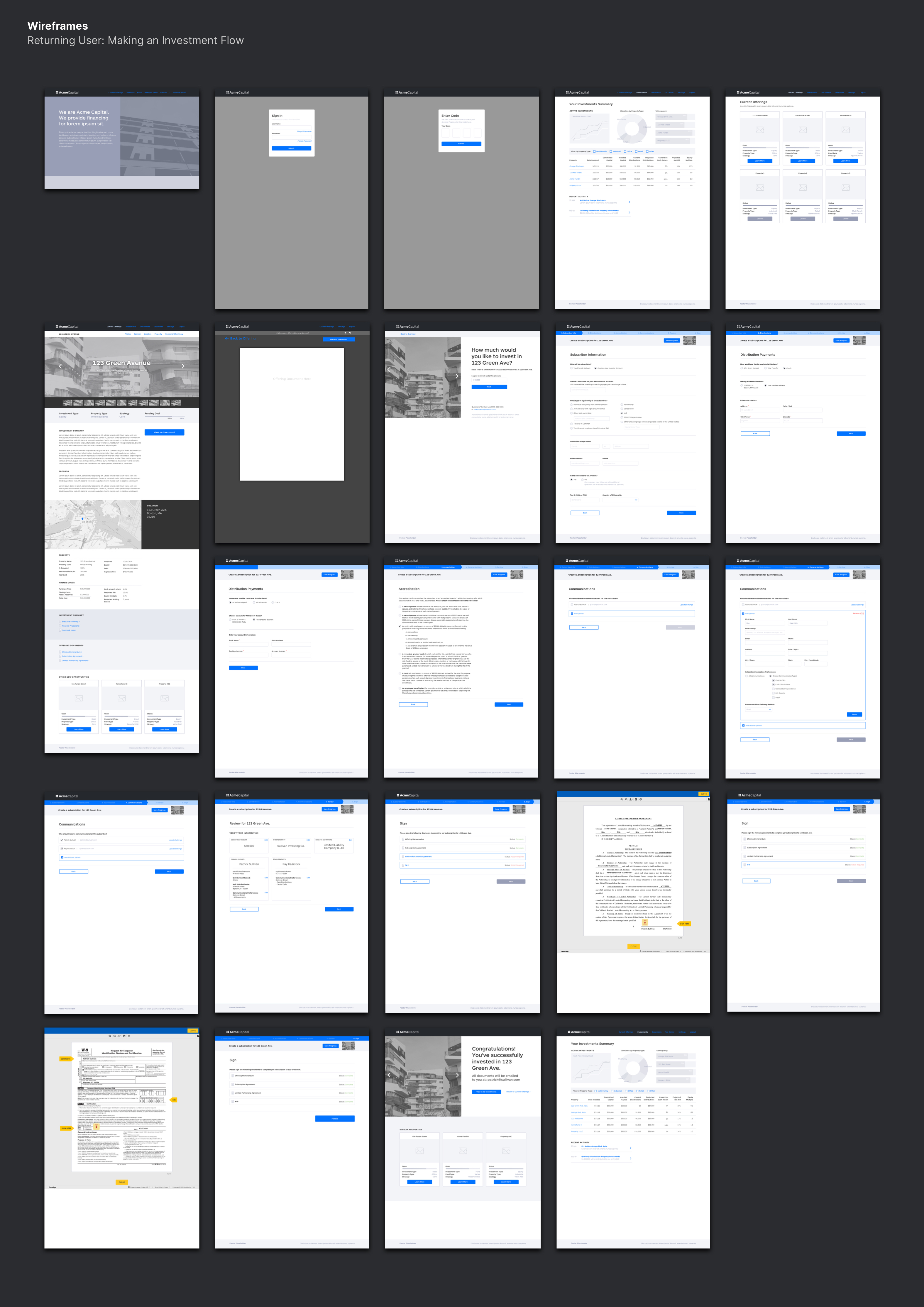
Sample User Flows and Wireframes
Users might not go any further if they don’t see sponsor info quickly
During usability testing we learned that sponsor information is critical for investors, which hadn't come up in earlier interviews (“sponsor” is the term of art for the person or company putting the investment opportunity together). In fact, we were told the sponsor is more important than the investment itself:
“Sponsor details are more important than the asset. I’m relying on the sponsor. I might not go any further if I don’t see who the sponsor is right away.”
We also learned that investors really want to see actual performance data compared to expected performance data, after making an investment. We heard, “This doesn’t tell me how this thing is performing. I need to see an income statement, and an actual budget for the year and for the quarter. Variances would be nice too.”
Lastly, we learned that if the placeholder financial data you use for your usability tests don’t quite add up, investor testing participants won’t be able to overlook the inaccuracy. We needed 100% realistic numbers to continue testing.
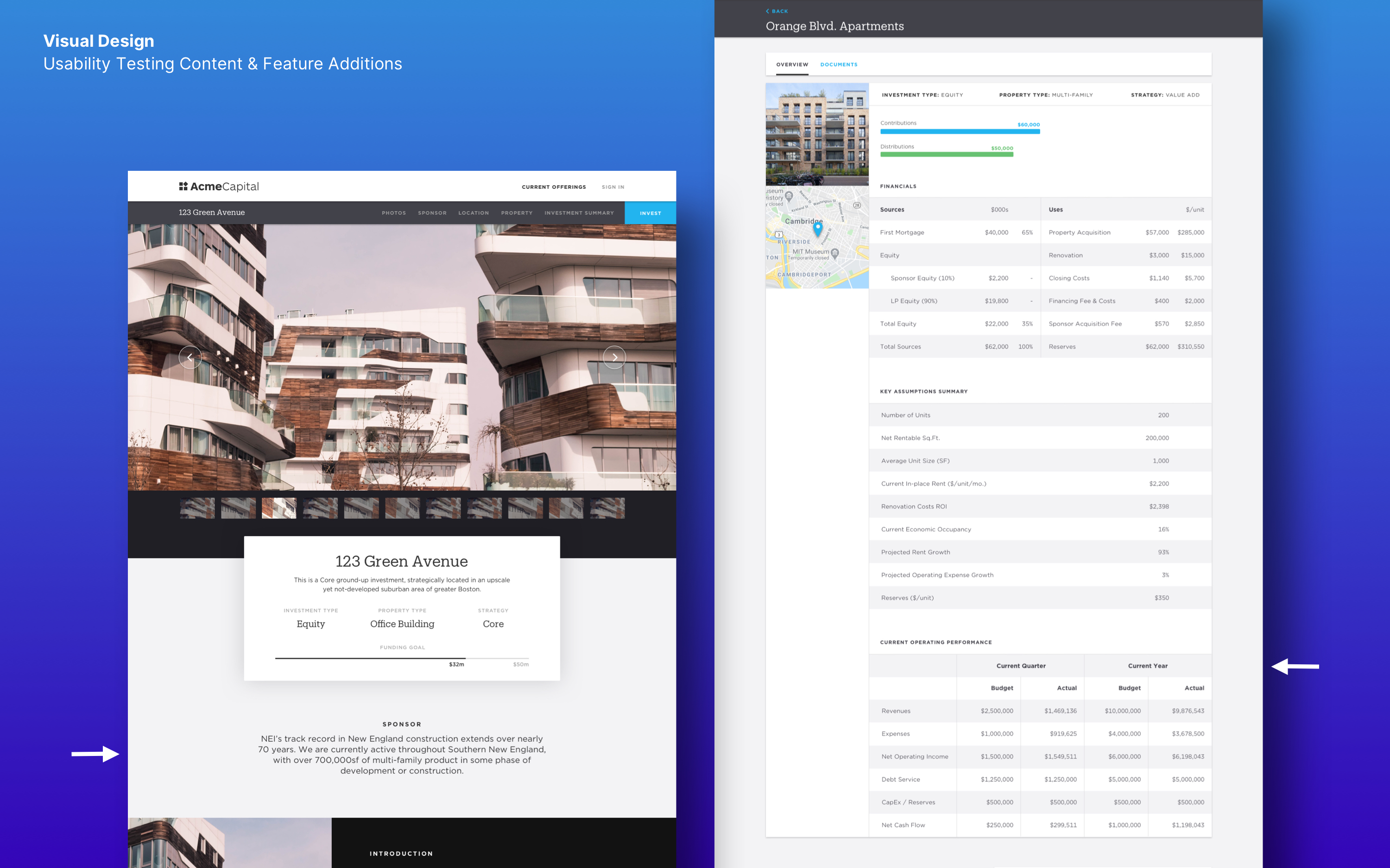
Added features
A single source of design truth
Our development team spanned 8 hours worth of time zones and multiple primary languages, so we created a detailed styleguide webpage to serve as the single source of truth for everyone working on the portal.
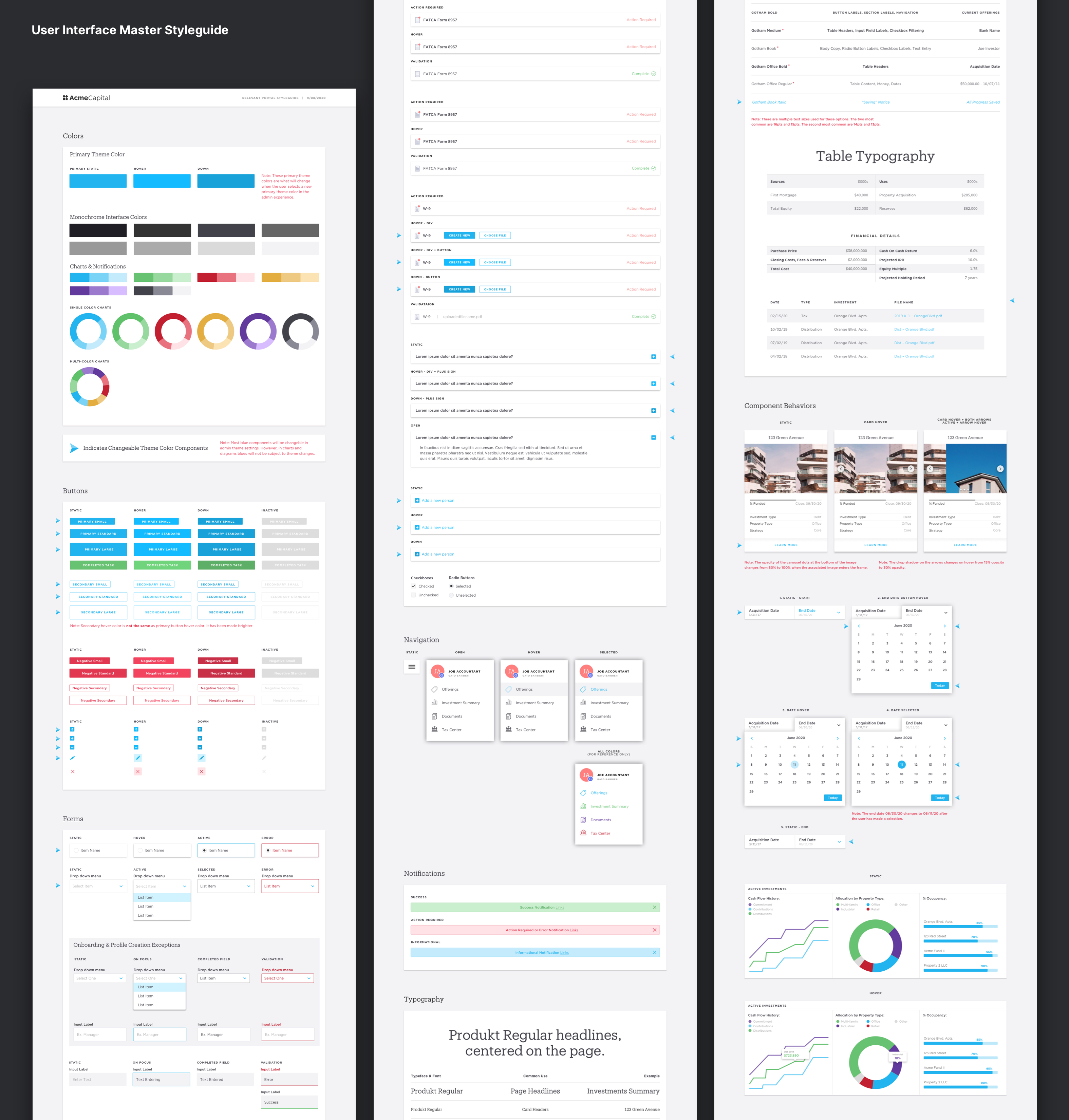
Design Pattern Library
A system of reusable components
Ultimately, we designed over 250+ pages with flexible components that can be refitted and reused to meet individual client needs. Here is a sampling of the platform we delivered.
"I wish we had this in the early days"
This project is currently beta-testing with a handful of investment firms raising their next fund on the platform. We are gathering data for the next phase, which will include the ability for accountants to make investments on behalf of their clients and an accompanying CMS for investment managers. For now, we're statisfied that Relevant's CEO remarked, "I wish we had this in the early days", during our final presentation.

